
It happens all too often: you’re scrolling through your feed and you see a well crafted data visualization with a compelling juxtaposition of two trendlines of data. They sit elegantly on top of one another following one another’s rises and dips. Surely, the untrained assume, these two data points show a clear causal relationship. One is causing the other.
This is week’s reminder: correlation does not imply causation.
The Guardian’s Nathan Green wrote, that “Despite embodying an important truth, the phrase has not caught on in the wider world.” This mainstream acknowledgement of what he refers to as a “statistical mantra” is the product of a lack of exposure and education to good research foundations. Nathan continues, “ our preconceptions and suspicions about the way things work tempt us to make the leap from correlation to causation without any hard evidence.”
Still, over half a decade later and this fact continues to bubble up on a daily basis. Our feeds now inundated with data visualizations on every side of every argument, it’s important that strategists, journalists, and even the everyday content consumer understands that while it may look like two things are interrelated in a measurable way, they may not be a direct cause of one another.
Take the graph below as an example:
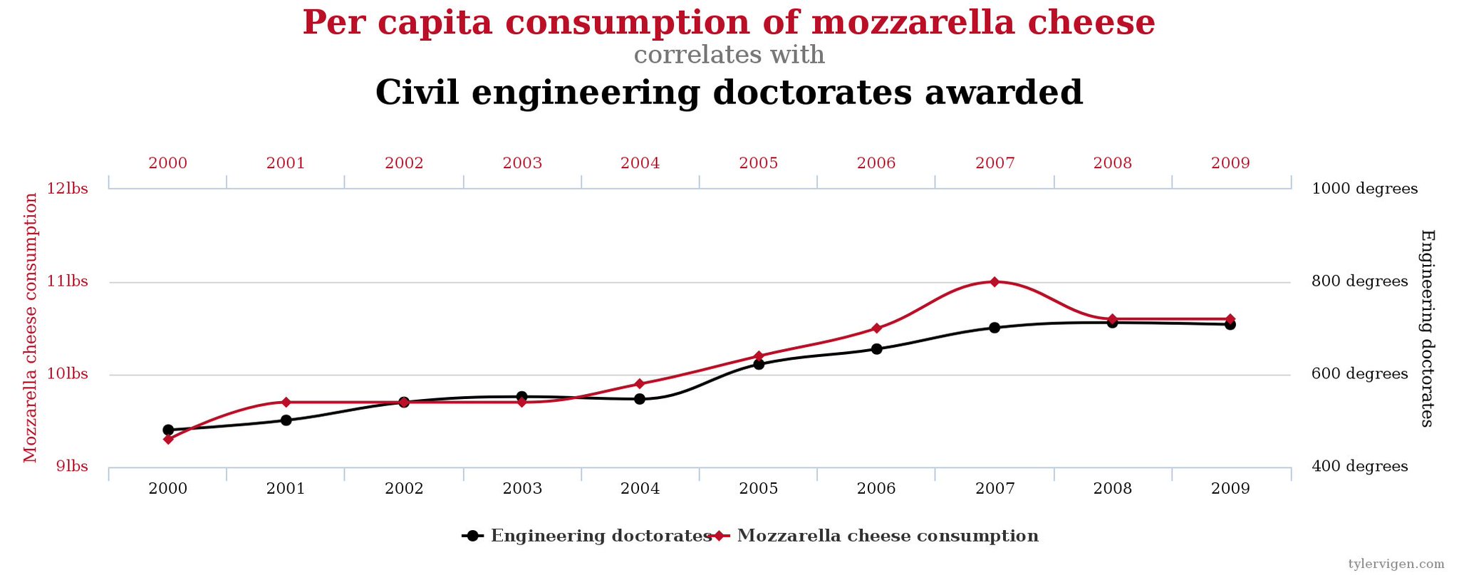
While both are true trends in data over a similar period of time, it would be a spurious exercise to suggest that the increase in per capita consumption of mozzarella cheese is, in fact, a cause for an increasing awarding of civil engineering doctorates. It is entirely possible that civil engineers enjoy mozzarella, but there is the missing element of confounding factors. This third factor, or factors, can be the root of why these trends follow a similar pattern.
So, next time you come across an unusual relationship between two unlikely trends of data, that seem to align just a little to well, ask yourself: is this correlation, or is this truly causation?


